KoolReport's Forum

Official Support Area, Q&As, Discussions, Suggestions and Bug reports.
Forum's Guidelines

Putting in a line (aka rule) between groups #2169

Closed Richb201 opened this topic on on Jun 29, 2021 - 7 comments

Richb201 commented on Jun 29, 2021

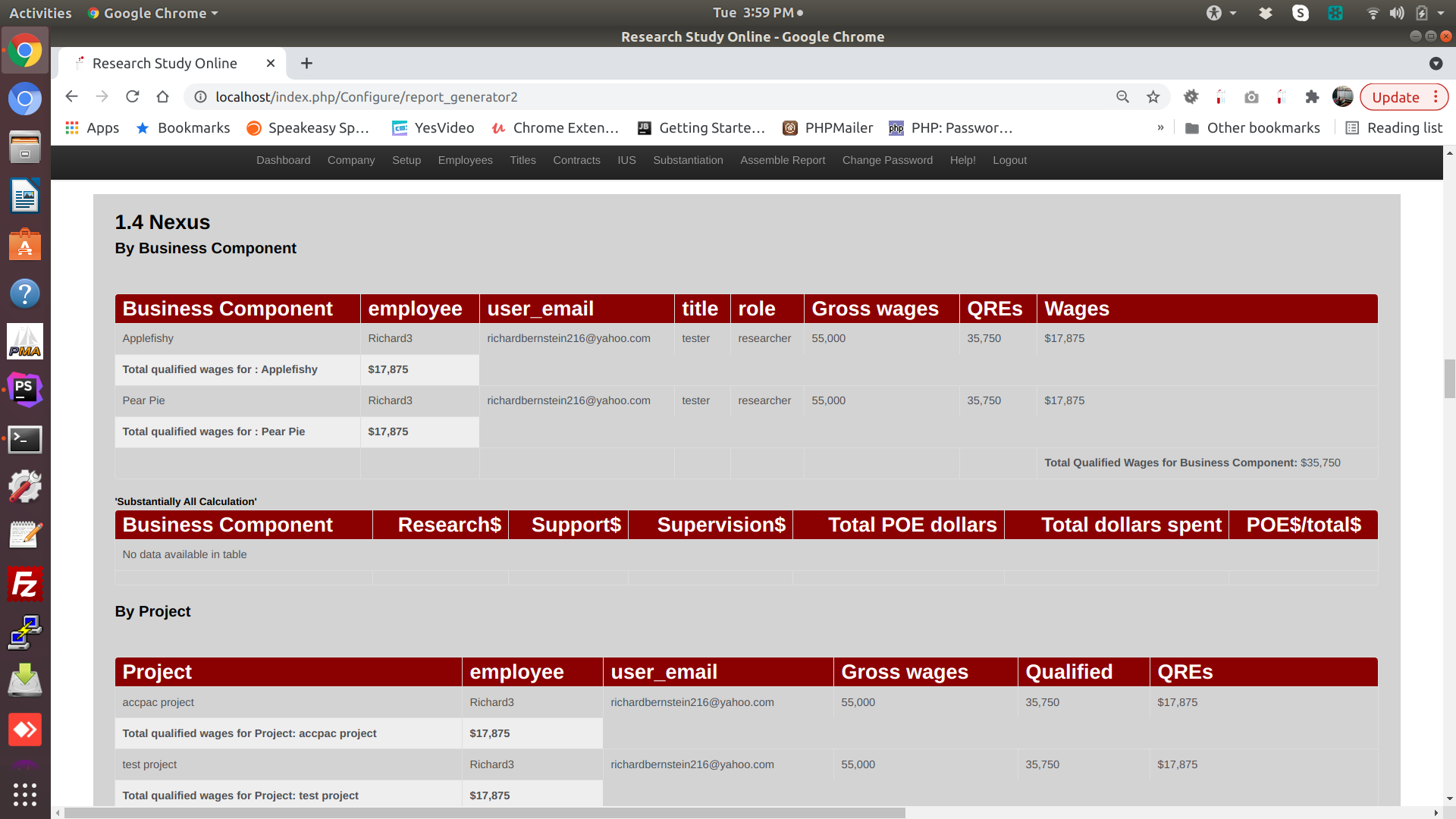
See the image below? I'd like to have some kind of divide between the Applefishy group and the Pear Pie group.

This is the code that is generating it. It is pretty hard to see that there are two different business components. Can I put a rule between them somehow?

Sebastian Morales commented on Jun 30, 2021

Pls put some wrapper divs for your top and bottom groups and set some CSS rules like this:

<style>
        tr.row-group {
            /*background: none !important;*/
        }
        tr.row-group td {
            padding:  0;
        }

        tr.row-group td div.wrapper-top {
            padding:  20px;
        }

        tr.row-group td div.wrapper-bottom-1 {
            padding:  0px;
            padding-bottom:  40px;
        }

        tr.row-group td div.wrapper-bottom-2 {
            padding: 20px;
            border-bottom: 1px solid #c7cbd5;
        }
    </style>
<?php
    Table::create(array(
        "dataSource"=>$this->dataStore('payments'),
        "grouping"=>array(
            "year"=>array(
                "calculate"=>array(
                    "{sumAmount}"=>array("sum","amount")
                ),
                "top"=>"<b><div class='wrapper-top'>Year {year}</div></b>",
                "bottom"=>"<td><div class='wrapper-bottom-1'><div class='wrapper-bottom-2'><b>Total of year {year}</b></div></div></td><td><div class='wrapper-bottom-1'><div class='wrapper-bottom-2'><b>{sumAmount}</b></div></div></td>",
            ),
        ),

Adjust the CSS rules for your likes. Rgds,

Richb201 commented on Jun 30, 2021

Thanks, I tried that and was not too happy with results. Perhaps i didnt explain well.
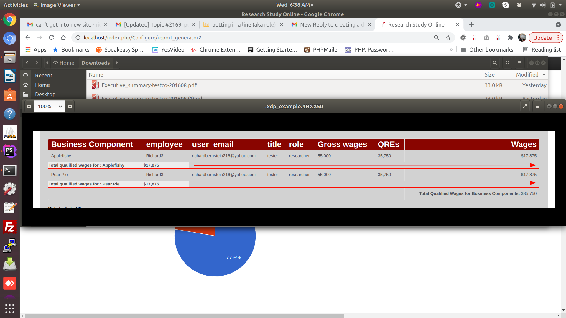
What I am trying to do is put a rule in under each group (in black, not red!). And also move the summary line to be right aligned.

I tried putting in hr tag:


"cssStyle"=>"text-align:right",
            "bottom"=>"<td><b>Total qualified wages for : {business_component}</b></td><td><b>{sumAmount}</b></td><br><hr>",


But that didn't work. Can you tell me what to use instead?

Sebastian Morales commented on Jul 1, 2021

Just set the border-bottom of row group's td:

        tr.row-group td {
            border-bottom: 2px solid black !important;
        }
Richb201 commented on Jul 1, 2021

Thx. How about moving that summary box to the right of the page (see red arrow)?

Sebastian Morales commented on Jul 2, 2021

Pls add some colspan for your row group's td like this:

    "bottom"=>"<td colspan='7'><b>Total qualified wages for : {business_component}</b></td><td><b>{sumAmount}</b></td><br><hr>",

Change the colspan value depending on the number of your column. Rgds,

Richb201 commented on Jul 2, 2021

looks good. One last thing. The number in the bottom needs to be aligned right. Where do i put this? "bottom"=>"<td colspan='7'><b>Total qualified wages for : {business_component}</b></td><td><b>{sumAmount}</b></td><br><hr>", "cssStyle" => "text-align:right",

Sebastian Morales commented on Jul 2, 2021

Pls put it in your td element:

     "bottom"=>"<td colspan='7 style='text-align: right'>...</td><td style='text-align: right'>...

or add a css rule like this in your page:

    <style>
        tr.row-group td {
            text-align: right !important;
        }

Build Your Excellent Data Report

Let KoolReport help you to make great reports. It's free & open-source released under MIT license.

Download KoolReport View demo
help needed

None