- What is a Heat Map Chart?
- What is a Heat Map Used For?
- When to Use a Heat Map?
- Data Format
- Color Range
- Additional Options
Heat Map Chart
What is a Heat Map Chart? #
A Heat map chart provides a graphical summary of information by representing a set of data through variations in colors. The visualized datasets may differ in hue, shade, or intensity so that users and data analysts can more easily read and understand how the values vary across time.
The JavaScript Heat map in ApexCharts uses bright-to-dull color spectrums to demonstrate which portion of a plot/page receives more attention than the other.
What is a Heat Map Used For? #
It is used to cross-examine multivariate data. Unlike charts where interpretation is required and tables where understanding is paramount, heat maps are self-explanatory and intuitive. The heat map graph and chart are ideal for making complex data sets comprehensible and actionable.
When to Use a Heat Map? #
Heatmaps are generally used to show relationships, intensity, and the difference between variables. Common use cases:
- To show user behavior on specific webpages.
- To display the magnitude of a data set over two dimensions.
- In retail matrix, manufacturing diagram, population maps.
- For marketing goals and analytics, reflecting on user behavior on specific webpages.
Data Format #
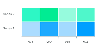
The data format for a heatmap chart is the same as used on other axis based charts (line/bar). Below example shows the accepted data-format for a heat map series. Labels for the dataPoints has to be provided in the labels array separately.
$data = [
    [
        'Metric_name',
        'W1',
        'W2',
        'W3',
        'W4'
    ],
    [
        'Series1',
        0,
        5,
        10
    ],
    [
        'Series2',
        10,
        15,
        20
    ],
    ...
];
$data = \koolreport\core\Utility::transpose($data);
\koolreport\apexcharts\HeatMapChart::create(array(
    "dataSource" => $data,
    "columns" => $data[0],
Output of the above code.
Color Range #
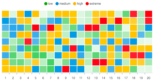
The cells of the Heat map are filled with the colors of the default color palette. Each series of the heat map row/column corresponds to the index of the main colors array.
By specifying the color range, you can override the default behavior and make each cell respond to a different color based on cell value. Below is an example of how to specify a color range.
'options' => [
    'plotOptions' => [
        'heatmap' => [
            'colorScale' => [
                'ranges' => [
                    [
                        'from' => -30,
                        'to' => 5,
                        'color' => '#00A100',
                        'name' => 'low'
                    ],
                    [
                        'from' => 6,
                        'to' => 20,
                        'color' => '#128FD9',
                        'name' => 'medium'
                    ],
                    [
                        'from' => 21,
                        'to' => 45,
                        'color' => '#FFB200',
                        'name' => 'high'
                    ]
                ]
            ]
        ]
    ]
]
In the code above, note the ranges array. It consists of 4 properties.
- from: Upper limit of the range
- to: Lower limit of the range
- color: Color for cells falling between this range
- name: Name of the range that appears in legend
The code above produces this output.
Additional Options #
Distributed #
In a multi-series heat map chart, each row in a heatmap can have it’s own lowest and highest range and colors will be shaded for each series. Helpful in situations when each series has a big difference in values.
'options' => [
    'plotOptions' => [
        'heatmap' => [
            'distributed' => true
        ]
    ]
]
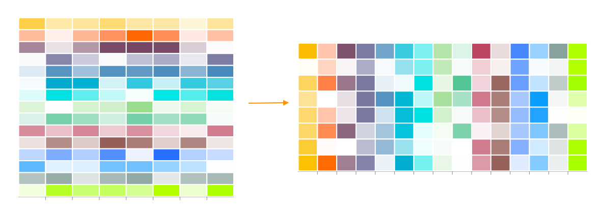
Inversed Color Scale #
In a multi-series heat map chart, if you want to inverse the color scale from rows to column, you may enable the plotOptions.heatmap.colorScale.inverse property.
'options' => [
    'plotOptions' => [
        'heatmap' => [
            'colorScale' => {
                'inverse' => true
            }
        ]
    ]
]
A quick illustration of the above setting.
Reverse Negative Shade #
In certain situations (for eg., in a profit/loss heatmap shown below), you may want the negative values to be darker for higher values. In such cases, you can turn on this option.
'options' => [
    'plotOptions' => [
        'heatmap' => [
            'reverseNegativeShade' => true
        ]
    ]
]
Border Radius of the Cells #
The cells are by default square-shaped. You may increase the border radius of the cells by
'options' => [
    'plotOptions' => [
        'heatmap' => [
            'radius' => 10
        ]
    ]
]
More configuration specific to heat map can be access at this page.
Get started with KoolReport
KoolReport will help you to construct good php data report by gathering your data from multiple sources, transforming them into valuable insights, and finally visualizing them in stunning charts and graphs.