- What is a Pie/Donut Chart?
- Data Format
- Donut
- Customizing Data Labels
- Changing the size of the pie
- Changing the size of the donut
- Donut Labels
- Disable slice expansion
Pie / Donut
What is a Pie/Donut Chart? #
Pie Charts and Donut Charts are instrumental visualization tools useful in expressing data and information in terms of percentages, ratios. A pie chart is most effective when dealing with a small collection of data. It is constructed by clustering all the required data into a circular shaped frame wherein the data are depicted in slices. In ApexCharts, the pie/donut slices can be crafted by patterns/gradients/images for increasing the visual appeal.
All the options and configuration described below will work for pie and donut charts both unless stated otherwise.
Data Format #
The data format for the pie/donut series is a single-dimensional array of numeric values as described below. The names of the values have to be provided in the labels array separately.
$data = [
    [
        'team',
        'series-1'
    ],
    [
        "Team A",
        44
    ],
    [
        "Team B",
        55
    ],
    ...
];
\koolreport\apexcharts\PieChart::create(array(
    "dataSource" => $data,
    "columns" => $data[0],
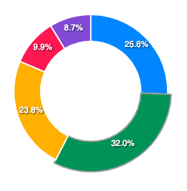
Donut #
Donut Charts are similar to pie charts whereby the center of the chart is left blank. The pie chart can be transformed into a donut chart by modifying the class name.
\koolreport\apexcharts\DonutChart::create(array(
    "dataSource" => $data,
    "columns" => $data[0],
Customizing Data Labels #
Data-Labels in pie/donut charts are the percentage values that are displayed in slices. 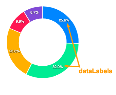
The configuration for these data labels has to be done in the following way.
'options' => [
    'dataLabels' => [
        'enabled' => true,
        'formatter' => 'function (val) {         return val + "%"       }'
    ]
]
Full documentation for dataLabels can be accessed here
Changing the size of the pie #
If the default size calculation of the pie doesn’t work great for you, you have some options to control the size of the pie/donut chart.
1. Set the scaling of the pie #
This is similar to CSS transform: scale() property where you can resize the pie/donut by providing a numeric value and it increases or decreases the size based on the value you provide.
'options' => [
    'plotOptions' => [
        'pie' => [
            'customScale' => 0.8
        ]
    ]
]
2. Set a fixed size #
You can also set a fixed size for the pie/donut. Note that the size which you set there won’t be responsive and will be fixed regardless the available width around it.
'options' => [
    'plotOptions' => [
        'pie' => [
            'size' => 200
        ]
    ]
]
Changing the size of the donut #
The inner donut radius can be controlled with plotOptions.pie.donut.size property. The value has to be a percentage value that will increase/decrease the spacing inside the donut based on the percentage you provide.
'options' => [
    'plotOptions' => [
        'pie' => [
            'donut' => [
                'size' => '65%'
            ]
        ]
    ]
]
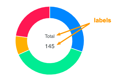
Donut Labels #
Apart from the dataLabels (percentages inside slices), you can also show donut labels when user hovers over a slice.
The donut labels configuration has to be done as follows.
'options' => [
    'plotOptions' => [
        'pie' => [
            'donut' => [
                'labels' => [
                    'show' => true,
                    'name' => [...],
                    'name' => [...],
                ]
            ]
        ]
    ]
]
Full configuration for donut labels can be access here
Disable slice expansion #
When you click on the pie/donut slice, it expands it’s size on selection.
You can turn off this default behaviour by setting
'options' => [
    'plotOptions' => [
        'pie' => [
            'expandOnClick' => true
        ]
    ]
]
Get started with KoolReport
KoolReport will help you to construct good php data report by gathering your data from multiple sources, transforming them into valuable insights, and finally visualizing them in stunning charts and graphs.